

Put on an icy blue top and your face looks tired — shadows darker, skin somehow greyer. Swap it for a rust-colored sweater and the same face, same lighting, same night’s sleep looks warm and awake. Nothing about you changed except eleven inches of fabric near your chin. That difference is undertone: the permanent warm or cool cast beneath your skin’s surface color, and the reason some colors flatter you and others quietly argue with you. If your undertone is warm, there is a whole palette that will work like good lighting. This is the deep dive: how to confirm your undertone, which colors are your home turf, how to bend the rules intelligently, and how to test any color before money changes hands.
Undertone is not skin color
The first thing to unlearn: surface depth and undertone are different axes. Skin can be fair or deep and warm or cool independently — there are porcelain-warm complexions and deep-cool ones, and every combination between. Undertone is the subtle hue showing through: warm skin carries golden, yellow, peachy, or olive-gold notes; cool skin carries pink, rosy, or blue-ish notes; neutral sits between. Because undertone never changes — you cannot tan your way from warm to cool — it is the most stable piece of style information you own. Wardrobe decisions built on it stay valid for decades, through hair color changes, weight changes, and every trend cycle in between.
Confirming you are warm: four tests that agree
No single test is reliable, so use several and take the majority verdict. The jewelry test: gold almost always looks more harmonious on warm skin; silver and platinum flatter cool. If your face looks brighter next to gold, that is a warm vote. The vein test: in daylight, veins at the inner wrist that look greenish suggest warm; blue-purple suggests cool. (The logic: yellow-toned skin over blue veins reads green.) The white test: hold pure white and then cream fabric near your face; warm skin usually prefers cream and ivory, while stark white can look harsh against it. The sun test: skin that tans golden-brown more readily than it burns leans warm; skin that burns pink first leans cool. If three of four agree you are warm, proceed with confidence — and if the tests split evenly, you may be neutral-warm, which simply means your range is wider than this article assumes. MasterClass’s guide to finding your skin undertone runs the same tests with photos if you want a visual reference while you check.
Earth tones: your superpower
Warm skin’s home turf is the palette of autumn landscape: olive, moss, rust, terracotta, camel, mustard, warm chocolate brown, bronze, and cream. These colors share your golden base, so instead of competing with your skin they extend it — the visual effect is that your complexion looks even, healthy, and intentional, and other people register “you look well” without knowing why. Earth tones also happen to be the easiest palette to build a wardrobe around, because they combine with each other almost automatically: olive with rust, camel with chocolate, mustard with warm navy. If you do nothing else with this article, shifting your near-face purchases toward this family will produce the largest visible improvement per dollar.
Warm versions of every color
Being warm-toned does not banish whole color families; it redirects you within them. Nearly every color exists in a warm and a cool version, and your job is to pick the right sibling. Red: choose tomato, brick, and warm scarlet rather than blue-red or raspberry. Pink: choose coral, peach, and salmon rather than fuchsia and magenta. Blue: choose warm teals, turquoise, and periwinkle-leaning blues rather than icy or royal blue — or wear blue in its denim form, which suits nearly everyone. Green: olive, moss, and warm emerald rather than mint or pine-cool. Purple: warm plum and mauve rather than lavender and violet. Yellow is your natural ally in mustard and marigold; the cool lemon version is the one to dodge. This “same color, warmer sibling” rule is the most portable skill in color dressing, because it works in any store, at any price, forever.
Whites, metals, and the colors to handle with care
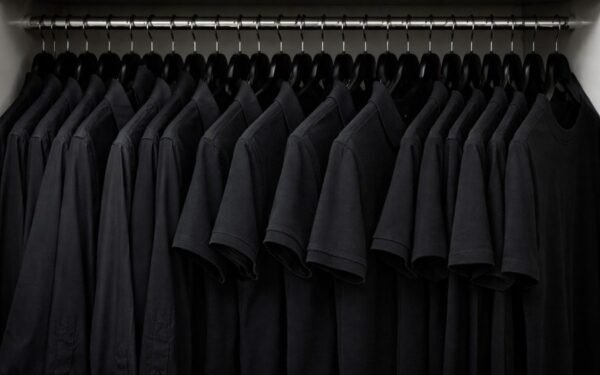
Your white is not white. Stark optical white has a blue cast that fights warm skin; cream, ivory, ecru, and warm off-whites do everything white does for an outfit while flattering you instead. The same logic governs metals: gold, brass, copper, and rose gold harmonize; silver and chrome can look disconnected near a warm face — relevant not just for jewelry but for glasses frames, watch cases, and bag hardware. Then the careful list: icy pastels (baby blue, powder pink, mint, lilac) tend to drain warm skin; cool jewel tones like sapphire and emerald-in-its-blue-form can overpower it; and black — the universal default — is actually a cool, high-contrast color that sits hard against warm coloring. None of these are forbidden. They are distances: keep a difficult color away from your face (as trousers, a skirt, a bag) and buffer it with a warm color at the neckline, and it stops mattering. A black dress with a gold necklace and warm-toned makeup is a solved problem, not a violation.
The variable nobody mentions: contrast and depth
Undertone decides which colors; contrast decides how strong they should be. If your hair and skin differ dramatically (dark hair, lighter skin), you can carry saturated, vivid warm colors — full rust, rich mustard. If your coloring is soft and close in value (light brown hair, gentle features), the muted, dusty versions of the same warm palette — clay, sage-olive, faded terracotta — will flatter you more than the vivid ones. Deep warm skin glows in rich, saturated warmth: copper, marigold, deep olive, warm burgundy. Fair warm skin usually needs the volume turned down: apricot, camel, soft gold. This is why two warm-toned friends can swap a sweater and only one of them lights up: same family, wrong intensity. When in doubt between two warm shades, hold both under your chin in daylight and choose the one where your face needs less “fixing.”
Neutrals and patterns: where warm wardrobes are won
Most of a wardrobe is neutrals, so get the warm set right and outfits assemble themselves. Your foundational neutrals are warm navy (noticeably softer on you than black), camel, chocolate and coffee browns, olive, stone, khaki, and cream. A wardrobe built on warm navy plus camel plus cream covers formal, casual, and travel without a single jarring note — and it explains a common warm-toned frustration: the closet full of black basics that never quite harmonizes no matter what accent color is added. The base was the problem, not the accents. Patterns follow the same rule with one extra check: read the pattern’s dominant background color first (that is the color your face will negotiate with) and then its secondary colors. Warm-based prints — autumnal florals, earthy plaids, tortoiseshell, animal prints in their natural coloring — are reliably kind to you, which is also why leopard print, essentially a warm neutral with ambition, flatters warm skin so consistently. Cool-based prints with icy backgrounds get the distance treatment: fine below the waist, risky at the neckline.
A practical note on makeup, since it sits even closer to the skin than clothing: warm-toned complexions match foundations labeled warm, golden, or yellow-based (often marked “W”), and the classic warm-side blush and lip colors are peach, coral, terracotta, and warm brick rather than blue-pink and berry. If foundation has ever made you look ashy or pink-grey in daylight, you were very likely handed a cool-toned shade — the undertone problem in its most common commercial form, and the easiest one to fix once you know to ask for the warm shelf.
The drape test: how to verify any color before buying
All of this theory cashes out in a thirty-second store ritual. In natural light (drag the garment to a window if the store lighting is theatrical), drape the fabric under your chin and look at your face, not the garment. A right color makes your skin look smoother, evens out redness and shadow, and makes your eyes look clear; a wrong one does the opposite — shadows deepen, sallowness or ruddiness increases, and you find yourself thinking about your makeup instead of the clothes. Test in cheap formats first when experimenting: a $12 scarf explores a color for a week; a $120 coat commits you to it for years. And since hair frames the face just as clothing does, the same undertone logic applies above the neck too — how to choose hair color for your skin undertone works through the warm-side shades (golden browns, copper, warm blondes) that complete the picture.
Learn your undertone once and you own a filter that sorts every rack, catalog, and sale rail into “for me” and “not for me” in seconds. Warm skin is not a limitation — it is one of the most flattering palettes there is, the colors of late-afternoon light. Dress in your own light.


2 Comments