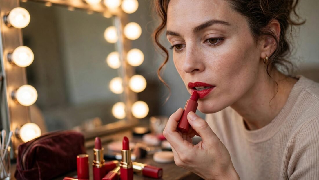
The red looked perfect on the back of a hand. It was rich, clean, and expensive-looking under the store lights. On the face, twenty minutes later, it turned orange. On someone else the same kind of shade can pull blue, look muddy, or simply sit apart from the skin as if it belongs to another person. That mismatch is rarely bad luck. It was decided by undertone long before the tube was opened, and undertone is the first thing to sort out. Once that is known, the rest of the choice gets much simpler: depth, finish, testing, and the occasion.
Red is less forgiving than a nude or a soft pink because the color is strong and small clashes show. The steps below follow a set order for a reason. Skipping to the finish or the brand first is how most people end up with a drawer of almost-right reds.
Step 1: Work Out Your Undertone With Three Quick Tests
Undertone is the color that sits beneath the surface of the skin. It stays the same even when skin tans or pales. Surface color can change with the season. Undertone does not. It falls into three broad groups: warm, cool, and neutral. Some people also describe themselves as olive, which tends to sit near neutral but with a greenish cast.
Start with the vein test. Look at the inside of the wrist in natural light. Veins that look greenish point toward warm. Veins that look blue or purple point toward cool. Veins that are hard to call, a mix of both, often point toward neutral. Fluorescent bathroom light can distort this, so stand near a window if possible.
Next, use the jewellery test. Gold tends to flatter warm skin and bring it to life. Silver and platinum tend to flatter cool skin. If both look equally fine, neutral is likely. Think about which metal makes the face look brighter in photos, not which metal you simply prefer to wear.
Then try the white-paper test. Hold a clean sheet of white paper beside a bare face. If the skin looks yellowish or golden next to the paper, warm is likely. If it looks pink or rosy, cool is likely. If neither shift is clear, neutral is a good working answer. No single test is perfect. When two of the three agree, trust that answer and move on.
Step 2: Match the Red Family to That Undertone
Warm skin suits reds with heat in them. Look for orange-reds, tomato reds, brick reds, and warm cherry shades. These echo the golden or peachy tones in the skin, so the color looks like it belongs. A strong blue-red on warm skin can look harsh and separate, as if the lips were pasted on.
Cool skin suits reds with a blue base. Look for blue-reds, berry reds, true cherry, and crimson. The blue base sits well with pink or rosy skin and brightens the face. An orange-red on cool skin often turns brassy and can make the skin look less even.
Neutral skin has the widest choice. A classic true red is the safest starting point, and from there it is fair to borrow from either side. Try a warm brick one day and a cool cherry another, then keep the one that needs less other makeup to work. Olive skin is often flattered by deeper, slightly muted reds such as brick, terracotta-red, and deep cherry. Very bright blue-reds can sit apart on olive skin, so test those with extra care.
Step 3: Adjust for Depth and Contrast
Undertone picks the family. Depth and contrast pick the strength. Depth is how fair or deep the skin is. Contrast is the gap between hair, skin, and eye color.
Fair skin can wear red very well, despite the common fear that it cannot. Blue-reds and true reds tend to pop cleanly. Very dark oxblood shades can overwhelm a fair face, especially in daylight. A sheerer formula is a low-risk entry point because the color builds slowly and can be stopped at one layer.
Light to medium skin has the widest range of all. Most reds in the correct undertone family will work, so the choice can turn on the occasion and the finish. Tan to deep skin carries rich, saturated reds beautifully. Brick, classic red, and deep berry show up with real presence. Very sheer or pale reds can look washed out, so a bolder, more pigmented formula usually does more.
Contrast matters just as much. Low-contrast coloring, such as fair skin with light hair and light eyes, tends to suit softer reds: sheer cherry, muted brick, or a red worn blotted down. High-contrast coloring, such as dark hair against fair skin, or deep skin with bright eyes, can carry bold, opaque reds and look intentional rather than overloaded. If a red feels like too much but the family seems right, keep the shade and soften the formula before switching colors completely.
Step 4: Pick the Finish and Formula, With Texas Heat in Mind
Matte gives the boldest, longest-lasting color, but it is the least forgiving. It shows dry patches, settles into lines, and demands a tidy edge. Matte liquid formulas can also crack in dry heat. They suit an evening event better than a long, hot afternoon.
Satin and cream bullets are the workhorses. They are comfortable, easy to reapply, and flattering across a wide range of ages. For a first red, a satin bullet is usually the smartest buy because small mistakes are easy to fix and the finish does not punish dry lips.
Sheer reds and stains give a softer wash of color. They are forgiving to apply, need no mirror for a touch-up, and work well for daytime. A stain is also a strong summer choice because it clings to the lip as the surface color fades. Gloss worn over a red adds shine and dimension, but it migrates more and needs more upkeep. Anyone who dislikes checking a mirror through the day should treat gloss as an evening extra, not a base plan.
For Texas heat, long-wear satin bullets and stains hold up best. Creamy bullets can melt and feather at the edges, and matte liquids can crack. Lip liner is the quiet insurance here. Choose a liner close to the lipstick shade and fill in the whole lip, not just the outline. That filled base keeps color in place as the top layer wears, so the lip fades evenly instead of leaving a ring around the edge.
Step 5: Sort Out the Teeth Question Early
One worry stops many people before they start: a fear that red will make teeth look yellow. The effect is real and it runs in a clear direction. Blue-based reds make teeth look whiter. The blue in the shade works against yellow tones, so teeth read cleaner by contrast. Orange-based reds do the opposite. They bring out yellow and can make teeth look more stained than they are.
If tooth color is a concern, default to a blue-red even if it is not a perfect undertone match. For most people the gain on the teeth outweighs a small mismatch elsewhere. That said, no lipstick fixes actual staining. Heavy staining is a dentist matter, not a shade matter, and it helps to keep those two problems separate rather than buying five reds to solve the wrong one.
Step 6: Test on the Fingertip or Jawline, Never Just the Hand
The back of the hand is the worst common place to test a red. Hand skin differs from lip and face skin in tone, texture, and undertone, so a shade that looks right there can shift badly on the face. Test on the fingertip instead. The fingertip is pinker and closer to natural lip color, so it gives a much better preview. A swipe along the jawline also works, since it shows the shade against the face rather than against an arm.
Use a disposable applicator at a counter for hygiene. At a drugstore where testers are limited, buy the single best candidate rather than three guesses.
Light is the other half of testing. Store lighting lies about red more than almost any other color. Step outside, or at least to a window, before deciding. Then wear the shade for an hour. Reds change as they settle. Some deepen, some fade in patches, and some look fine for ten minutes and then turn harsh. That hour shows the true color and the true wear pattern. While checking, hold the shade against the clothes worn most often. A red can suit the skin and still clash with a wardrobe built around colors it fights.
Step 7: Build a Small Set for Different Occasions
One red rarely does every job. A practical set has two: a polished everyday red and a fuller statement red. The everyday red is usually a sheer or satin in a muted brick, a soft cherry, or a warm red in the correct family. Blot it once after applying and it reads as a lived-in stain, professional rather than dramatic. Pair it with light eye makeup, since strong red lips plus heavy eyes can overwhelm a face in daylight. Questions about the rest of a simple face often come up at this point, including how to stop makeup creasing under your eyes on long, hot days.
The statement red is full opacity, in the most saturated version of the matched family. This is where a blue-red showstopper or a rich orange-red earns its place, for an evening, a photo, or an event. Keep the eyes defined rather than heavy so the balance stays right.
For outdoor summer events, stains win again. They survive heat, humidity, drinks, and food with the least care. Pack a bullet for touch-ups rather than a liquid matte. General shade-matching advice from sources such as Allure’s lipstick and shade-matching guides follows the same broad logic: undertone first, then depth, then finish, tested in real light.
Step 8: Adjust the Approach for Age and Lip Condition
Red shows the condition of the lips, so prep matters. Smooth dry skin gently once a week and moisturize at night. Apply red to comfortable lips, not lips coated in thick balm, or the color will slide.
Older wearers can wear red just as well, with two changes. Avoid very dark mattes, which settle into lip lines and make them more visible. Prefer satin finishes and use liner across the whole lip to stop feathering into fine lines around the mouth. A sheerer build often looks fresher than a hard edge. Buy one good candidate, wear it for a week, and only then decide on a second shade. One red that fits beats five that nearly fit.